Top Trends in Modern Website Design
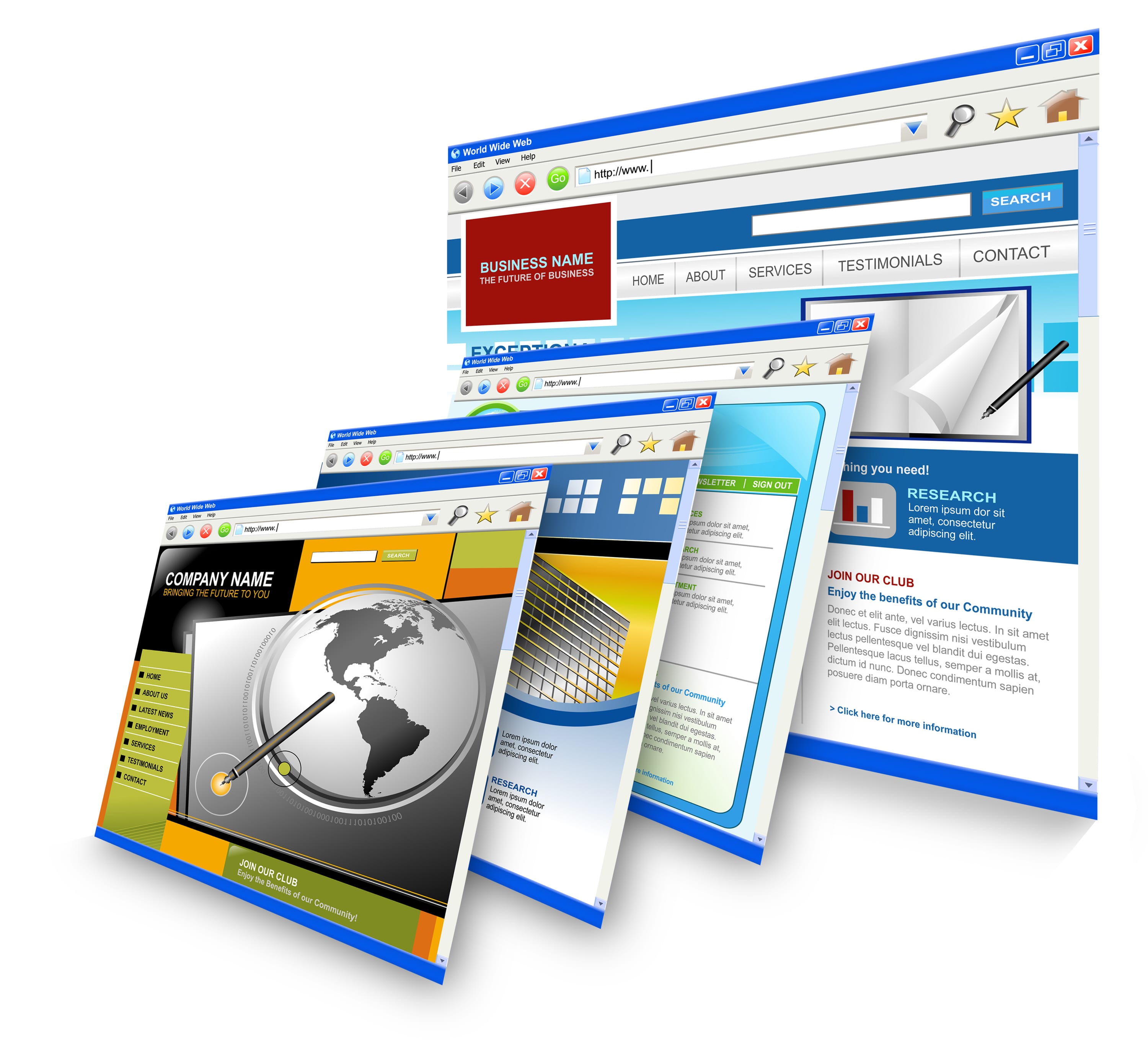
With 2014 already settled in, it is time to think about what the current website design practices have to offer to the modern web enthusiasts. The past year has seen major shifts in how web looks and functions with newer design trends and technologies making foray into the field of web design and development. The days of the ‘pop’ culture are long over and cluttering web pages with never ending streams of words is no longer acceptable. Simple, short and trendy is what the modern web looks like. Let’s explore some of the top trends in modern web design.
Flat is in, fat is out
Have you noticed this new design trend that is making websites look cool and trendy? This is the flat design trend that is taking the website designing field by storm. What it means is, that websites are designed in a way that make them look, well, flat. No more drop shadows and gradients and textures to make your web pages look exciting. The web design has matured to a level where a more uber-cool and simple flat web design with minimal use of effects and colors is the in thing. Using simple icons, simple, easily readable and big typography, plain colors, etc. are the salient features of flat web design.
Minimalistic approach
As flat web design has made the web look more polished and mature the simplicity of design and content is becoming more and more appealing to web users. A minimalistic approach in design is being used widely by most good web designers. It makes your website look much more elegant and graceful. With fewer embellishments to the important design elements such as icons, buttons, images and even text, everything looks clean and neat and the visitors find it easier to focus on what they are looking for without getting distracted by all those excessive design elements.
Responsive web design
With phenomenal development in the mobile technology and mobiles, smartphones, tablets becoming the preferred and widely used platforms for internet browsing, it became important to morph the web to fit these tiny screen sizes. Responsive web design made it possible to make your websites so flexible that they can now be seen on mobile phones without any loss of content or quality. You get almost the same experience of surfing the net that you get on a desktop or laptop computer. This is important for any business in order to reach the widest possible range of customers.
Mobile SEO
With mobile technology becoming widespread even the website SEO is taking newer forms. Mobile SEO is gaining importance over the traditional SEO practices. Mobile SEO is geared towards the mobile users and offering the best user experience to them. Since the user experience provided by a website to its visitors is one of the most important factors in engaging them, it can directly affect the search rankings. What is more important is that this can increase the conversion rate of the site significantly. It is therefore becoming important to make a website mobile friendly as well as using mobile SEO to improve its usability and rankings.


