7 Elements of a Good Landing Page Design
The landing page is one of the most important tools in an online marketer’s arsenal. They should be given as much priority as any other aspect of the online presentation. Landing pages are one the most experimented and tested aspects of lead generation. So, if we say, have a stellar landing page, there’s proof to back it up!
A landing page is NOT your homepage. However, it is the first page your visitor will see. It is a destination for social media, email links and placed advertisements, but more importantly it receives the ranking for your company and brand in search engine result pages.
The defining feature of your landing page is that it presents an offer to visitors and provides them an opportunity to accept this offer. It is similar to a shop window displaying its products. It tempts you to enter with its products, product displays, discounts, and offers. This is why many small and big companies will look for the best landing pages and software to create themselves the best possible landing pages for their business to generate leads and hopefully paying customers.
Considering how important a landing page is, here are some of the elements that encompass a good landing page.
1) A Superb Headline
Countless studies have demonstrated that a web page has just a few seconds, 5 to 10, to capture a visitor’s interest. This makes a strong headline absolutely necessary. Good headlines incorporate attention-grabbing, compelling and action-oriented language.
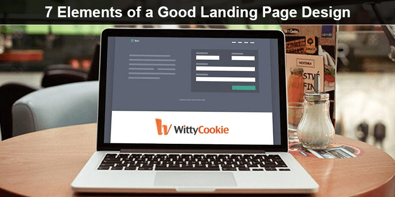
A good example is InboxDollars’ landing page. The headline reads “Earn Cash” in bold, large letters.
Another key point to remember is to be honest. If your headline promises one thing and delivers something else, you will push away leads.
2) Beneficial Landing Page Offer
Landing pages are about a value proposition. Whether you use a graphic or text-focused design, every element on your landing page will push the idea that the offer on the landing page is useful to the visitor. Pitch the offer as a solution to the problem.
Keep self-promotion to a minimum. Include how your service or product will benefit them.
3) Be Precise
Over-generalization is the cause of death for marketing copy. Your offer should be as specific as possible. It would be great if you can include statistics or hard data to back up your claims.
At the moment, most visitors love dealing with numbers and are easily swayed by them. But honesty should always be the main concern. Do not include claims that you cannot prove. Include citations of all stats that are used.
4) Build Urgency
The language surrounding urgency is an old marketing trick. Phrases like “This is a limited time offer!” and “Only five remaining, buy yours before it sells out” are psychologically speaking and effective. In the online realm, these measures must be used carefully. Most online visitors are savvy. They know you’re not going to run out. So use urgency-based language when there is the actual need.
The best places to use urgency language are:
- Limited-time sales
- Streamed or live events with maximum capacity
- Holiday delivery dates
- Money is actively lost
- Physical items that have a limited-edition run
5) Include a strong Call-To-Action
To complete a landing page deal, the visitor has to interact with a button or form called a call-to-action or CTA. This should be eye-catching and preferably in a different color from the rest of the elements on your page. You can also use design elements to prompt visitors’ eyes to the action space. Avoid using boilerplate text on interaction buttons. Examples include “click here” and “submit”. Be specific about what’s going to happen. Use phrases such as “watch our video”.
6) Good Graphic Design is Essential
The scope of graphic design is infinite and impossible to capture in a few phrases. Suffice it to say, you must use every possible tool in your arsenal to push the offer and encourage conversions. Focus on:
Color: This element has a massive psychological impact. Blue is peaceful, red indicates warning and yellow indicate brightness or excitement.
White space: Your landing page does not have to be covered in graphics or text. Keep breathing room between all items.
Images: Mix imagery and text. Placing too much emphasis on either will make it awry. If you must, have more graphics instead of text.
Videos: This element has the ability to increase conversions like no other, so including it just makes sense!
7) Focus on a single offer with a clear Intent
Keep your landing page focused on a particular offer. Everything else on that page should support this single offer. There should be a match between what is offered and what is pitched. If possible, match the language of your CTA to the opening paragraph or headline. For example, the banner may state, “click here to earn a 10% rebate” and the opening paragraph or headline may say, “Earn 10% in rebates with our club membership”. This reassures visitors.
The landing page is one of the most important elements of your web page. By including the elements listed above, you will create a page that will draw in more visitors than your competitors.
For more information about landing pages, please contact the design team at WittyCookie.